Kickstarter
Linking credibility to crowdfunding and improving navigation
Ambition
How might we increase the success rate of Kickstarter’s crowdfunding campaigns?
Tools
Figma
MiroWhimsical
Google Forms
Roles
UI Designer
UX ResearcherContent Designer
Timeline
3 weeks
3 weeks
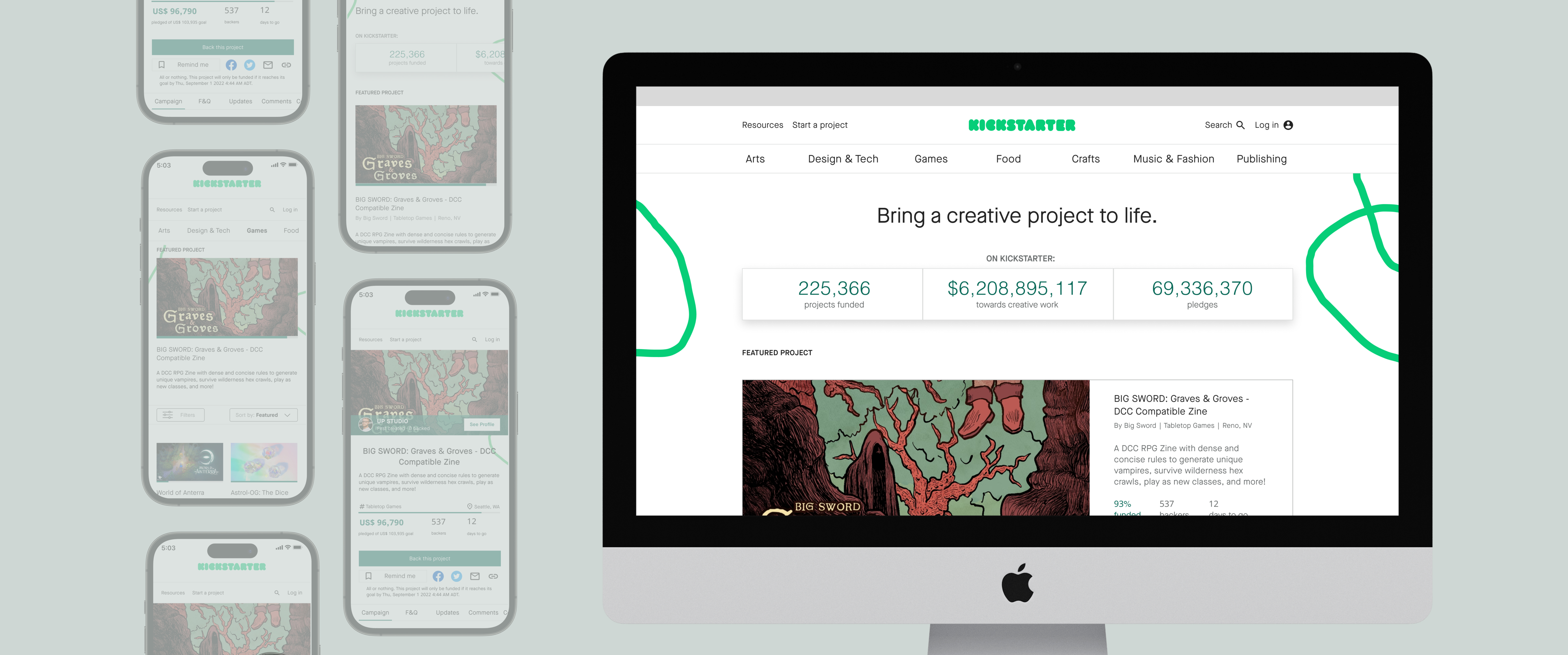
Project Overview
Kickstarter is a crowdfunding platform for creatives, focusing on art, tech, publishing, and game related campaigns. It currently struggles with a low campaign success rate of 10%, despite the increased traffic in recent years. We wanted to understand what hinders users from pledging in order to increase conversions and build a competitive advantage.
Defining the Terms
Let’s define Kickstarter’s lingo before delving into the case study:
︎︎︎ Campaign: The crowdfunding effort
︎︎︎ Creator: The person who starts a campaign
︎︎︎ Pledge: A donation
︎︎︎ Backer: The person who makes a pledge
︎︎︎ Reward: What the backer receives if the campaign is successful
Problem
Poor navigation and a lack of project updates deters users from pledging
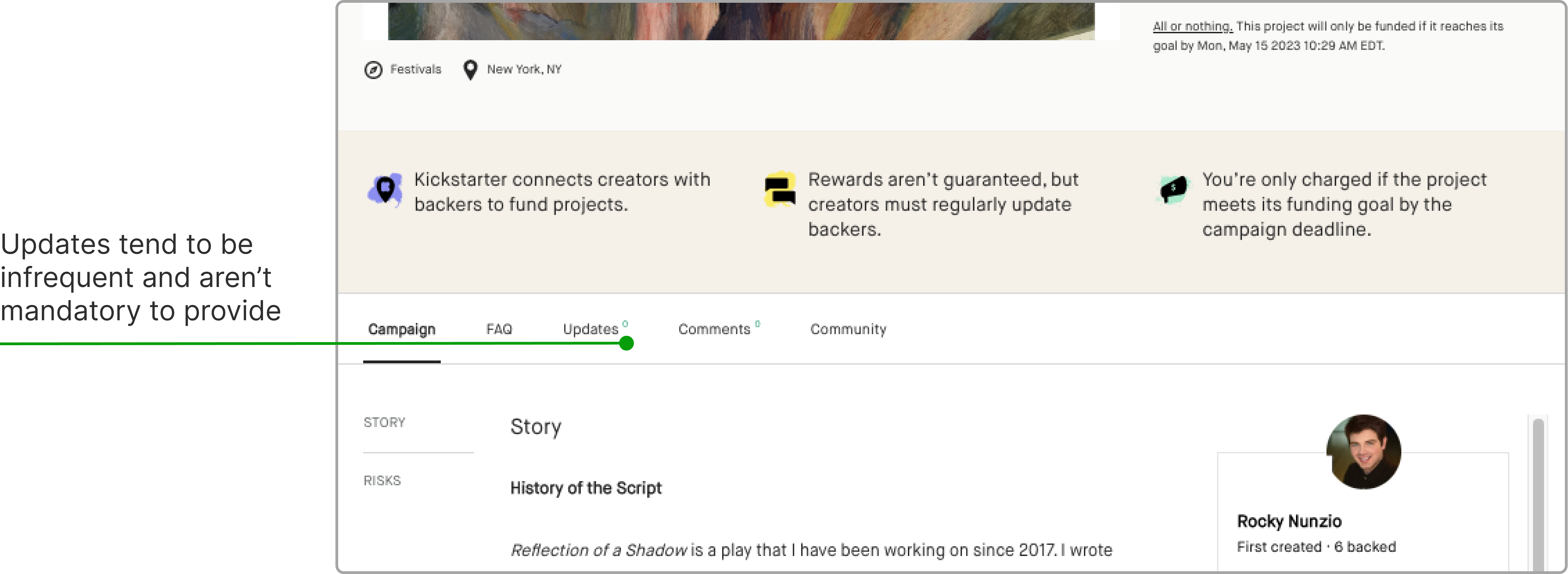
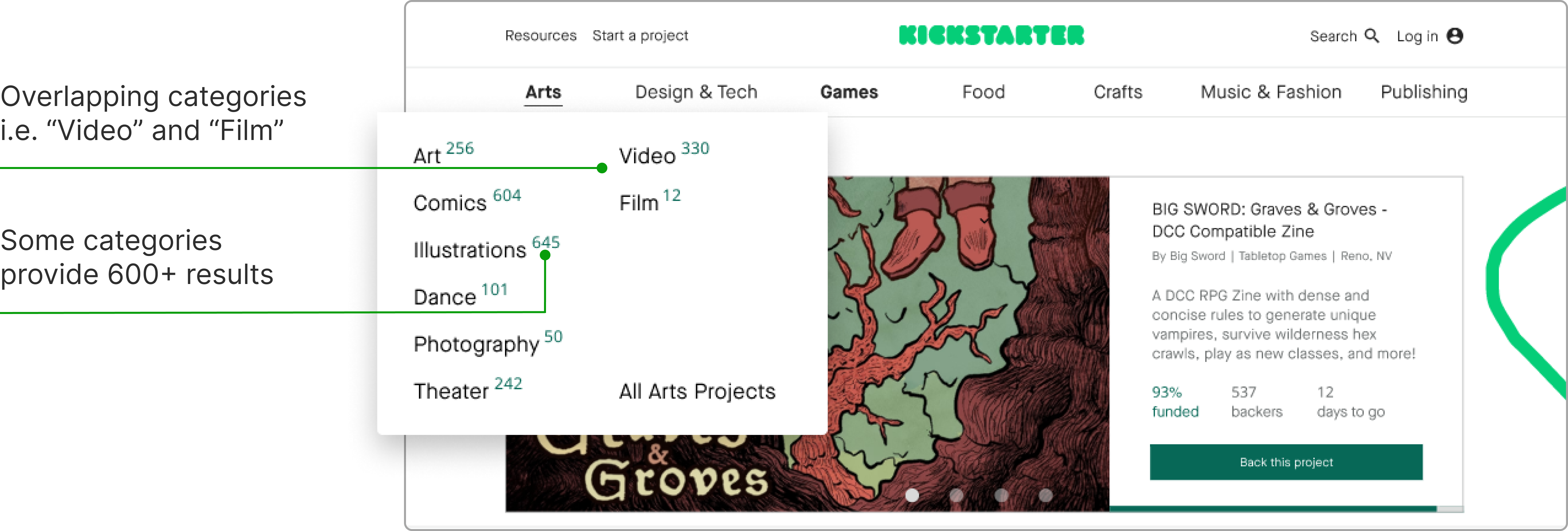
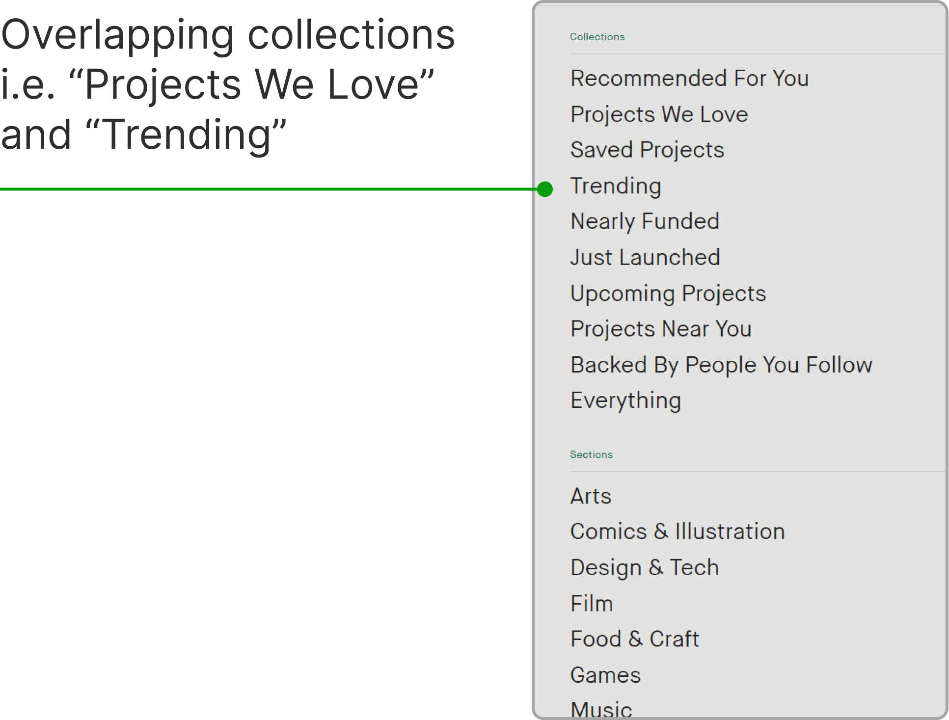
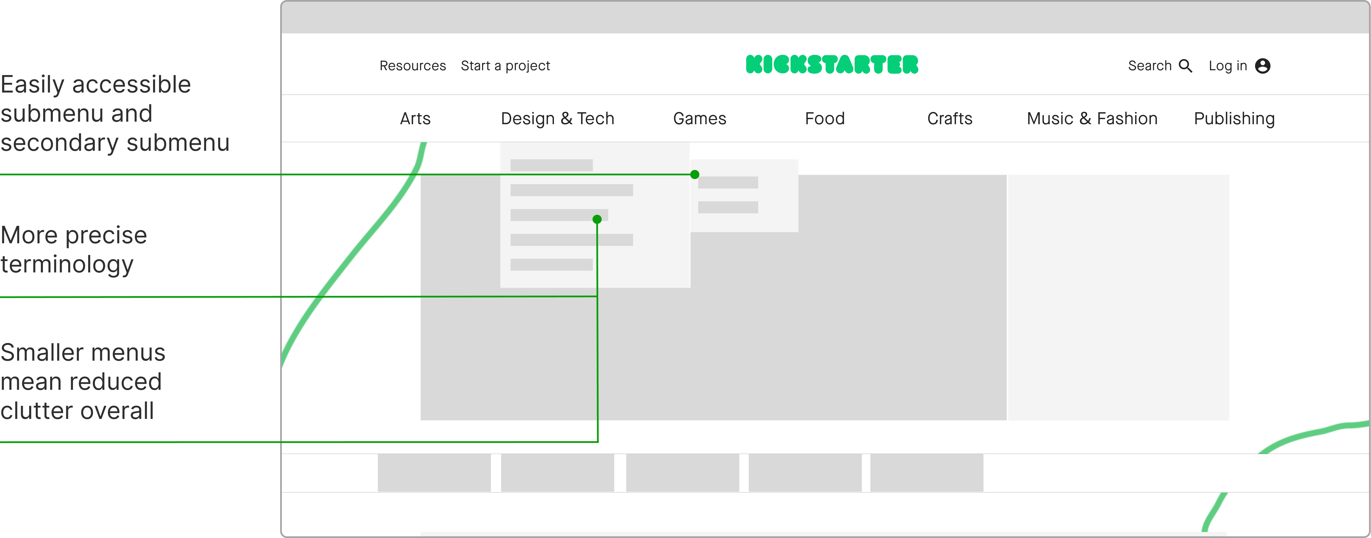
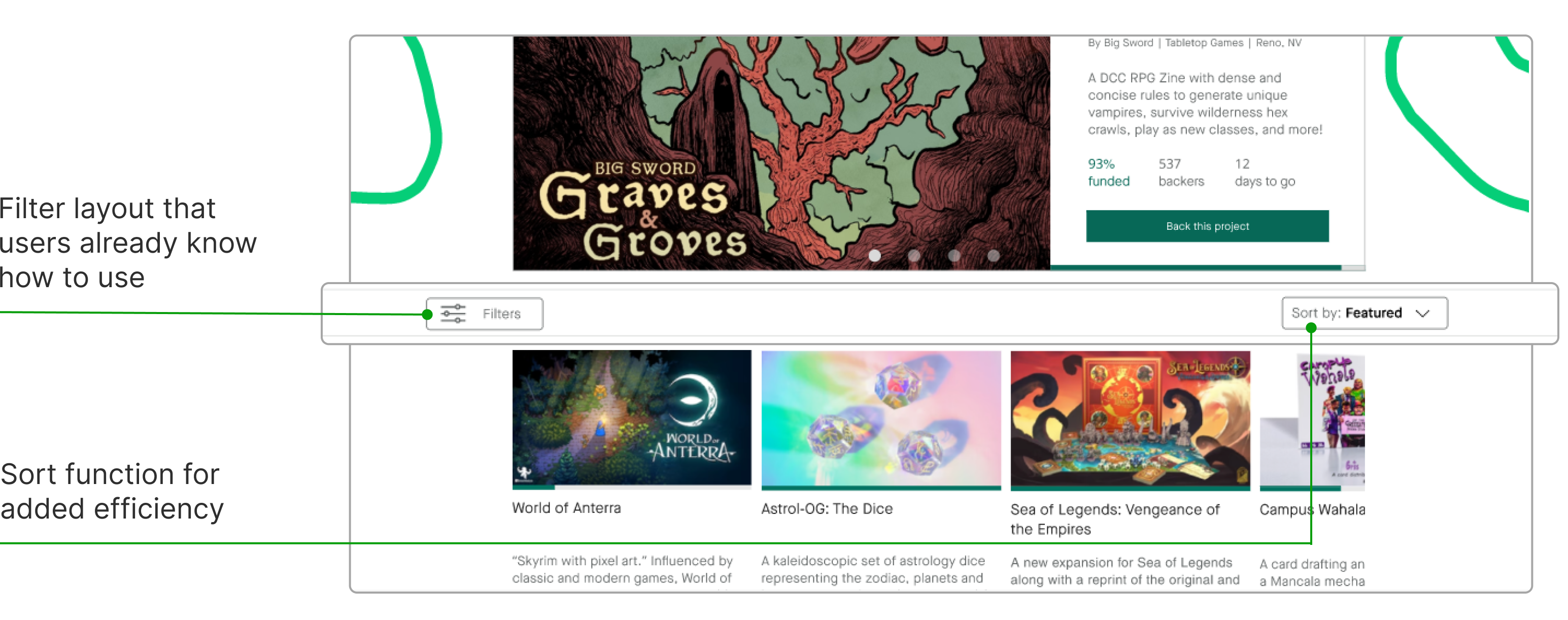
Menu options were redundant and much too broad, with some categories even producing up to 600 results. Filters were also unintuitive and used unconventional language. These dramatically increased the amount of time users spent finding the right campaign. Once users landed on a campaign page, they felt unmotivated to pledge due to a lack of updates and open communication from the creator.
Solution
A decluttered menu, simplified filtering, and a campaign progress bar
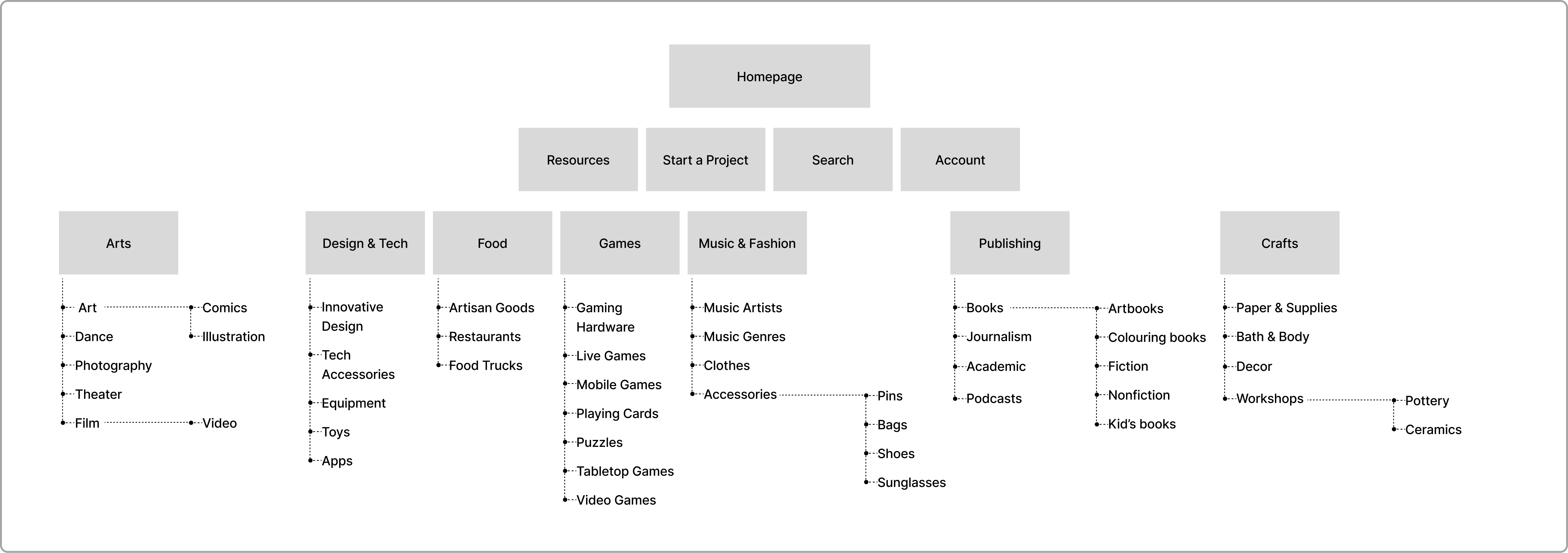
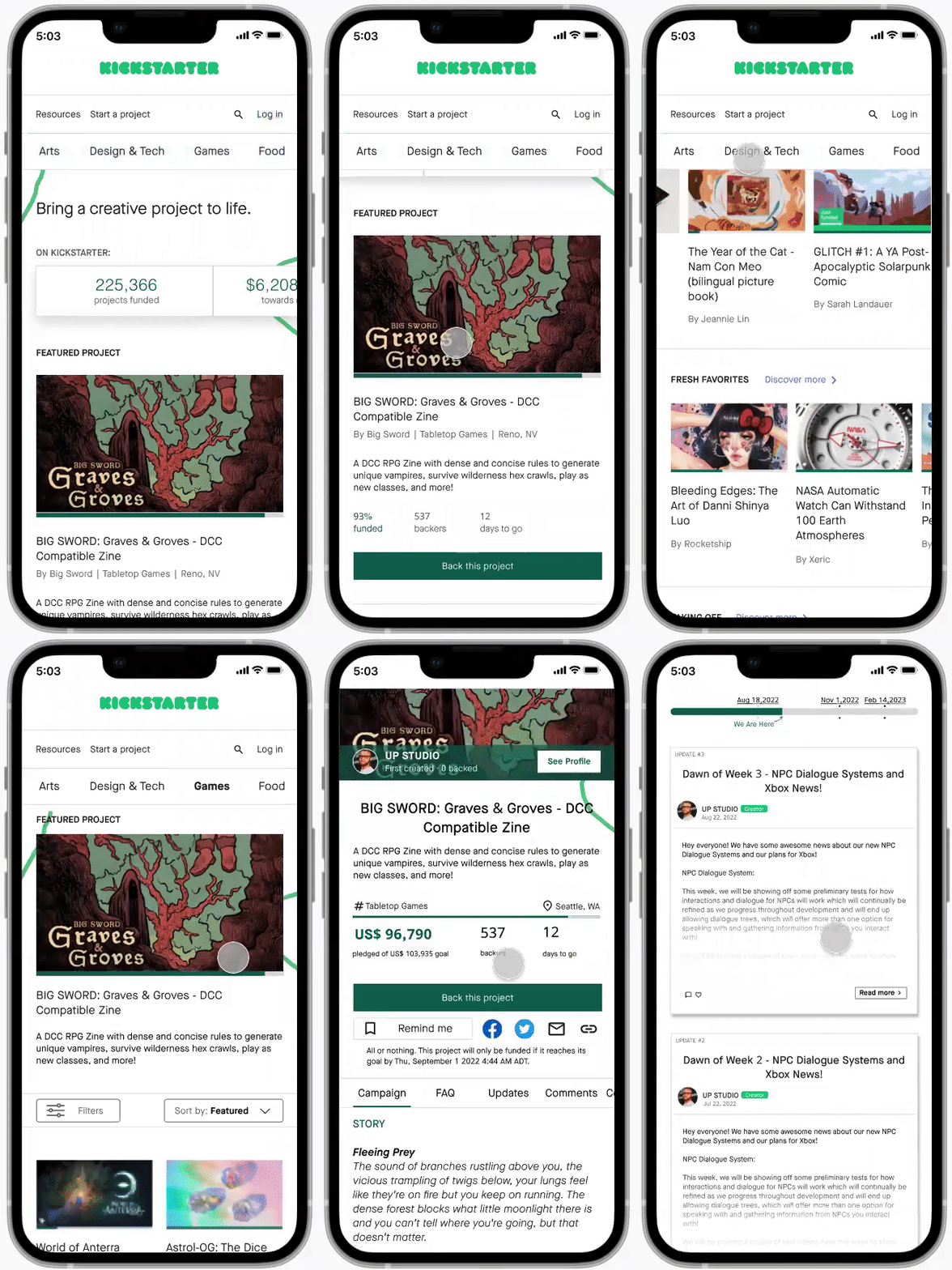
To help users find a campaign more efficiently, we reorganized the menu’s information architecture and simplified the filter language. From research to prototypes, our team also designed a progress bar to promote active communication and transparency between creators and potential backers.
Market Research
We began with exploring the crowdfunding market by performing a competitive audit. We discovered that comparable platforms largely emphasize intuitive menu navigation, easy filtering, and communication between creator and backer (or buyer and seller, in some cases).


User Research
Surveys + Interviews
We followed by conducting 23 surveys and 10 contextual interviews with users within Kickstarter’s primary age demographic of 25–34. We wanted to understand their goals, motivations, and frustrations when it came to online crowdfunding.
After synthesizing the research, our data revealed 3 key insights:
1. Frequent communication builds trust
The majority of creators are solo artists or indie companies that aren’t widely known, so users want to be able to trust that they can follow through with a project. Communicating project progress is a way to build that trust.
2. Seek specific campaigns
Users typically visit a crowdfunding website to look for a specific campaign, but don’t always know the exact name. Intuitive search and navigation is vital for these users.
3. Don’t want to waste any time
Users want to complete their tasks efficiently. They don’t want to spend too much time finding the right campaign or parsing through project details.
User Persona + Journey Map
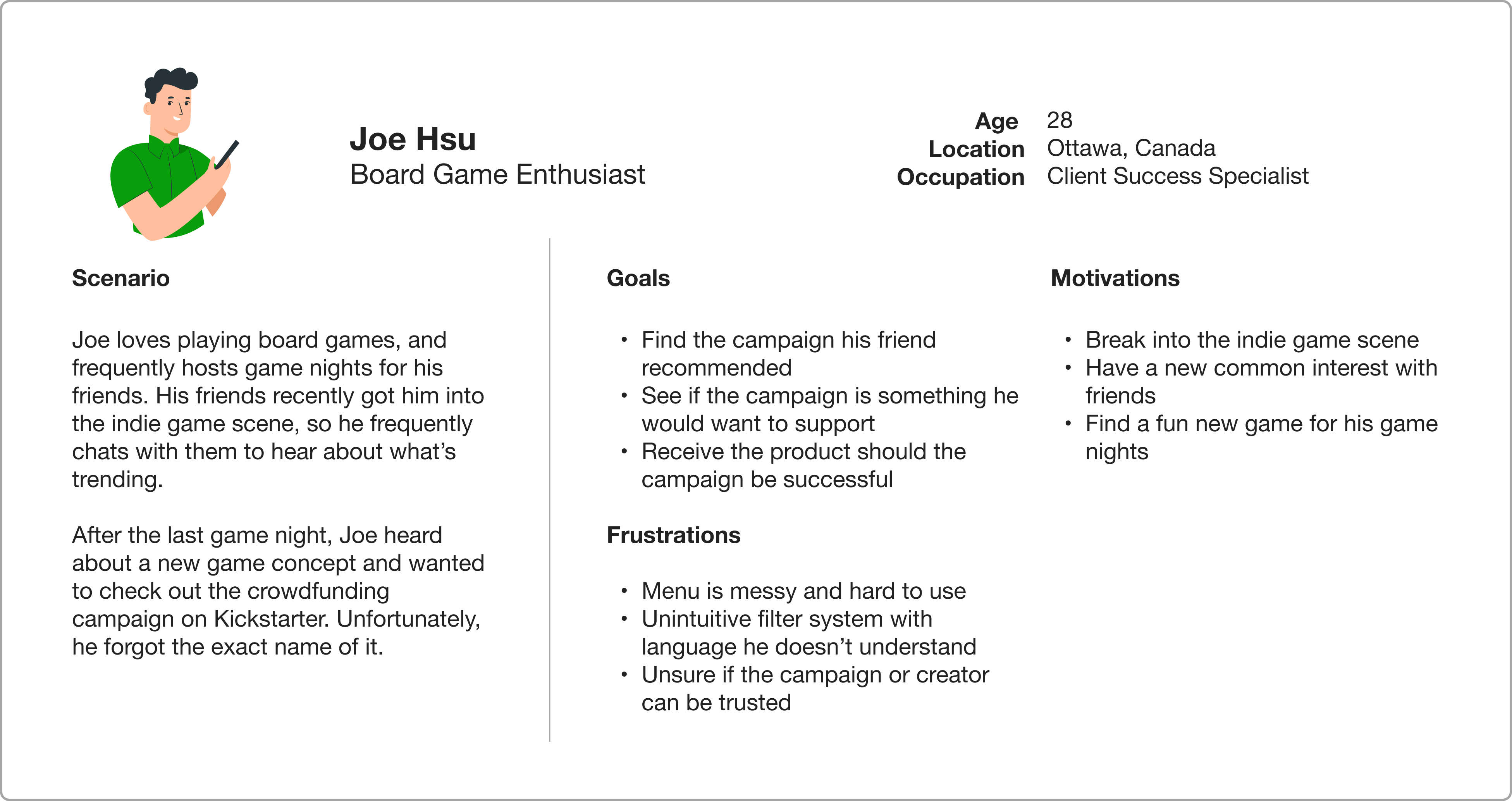
We developed a user persona and journey map based on our research findings. Meet Joe, a board game enthusiast who loves to explore the indie realm of gaming. He recently heard about a new board game concept from a friend, and wants to check out the crowdfunding campaign for it.
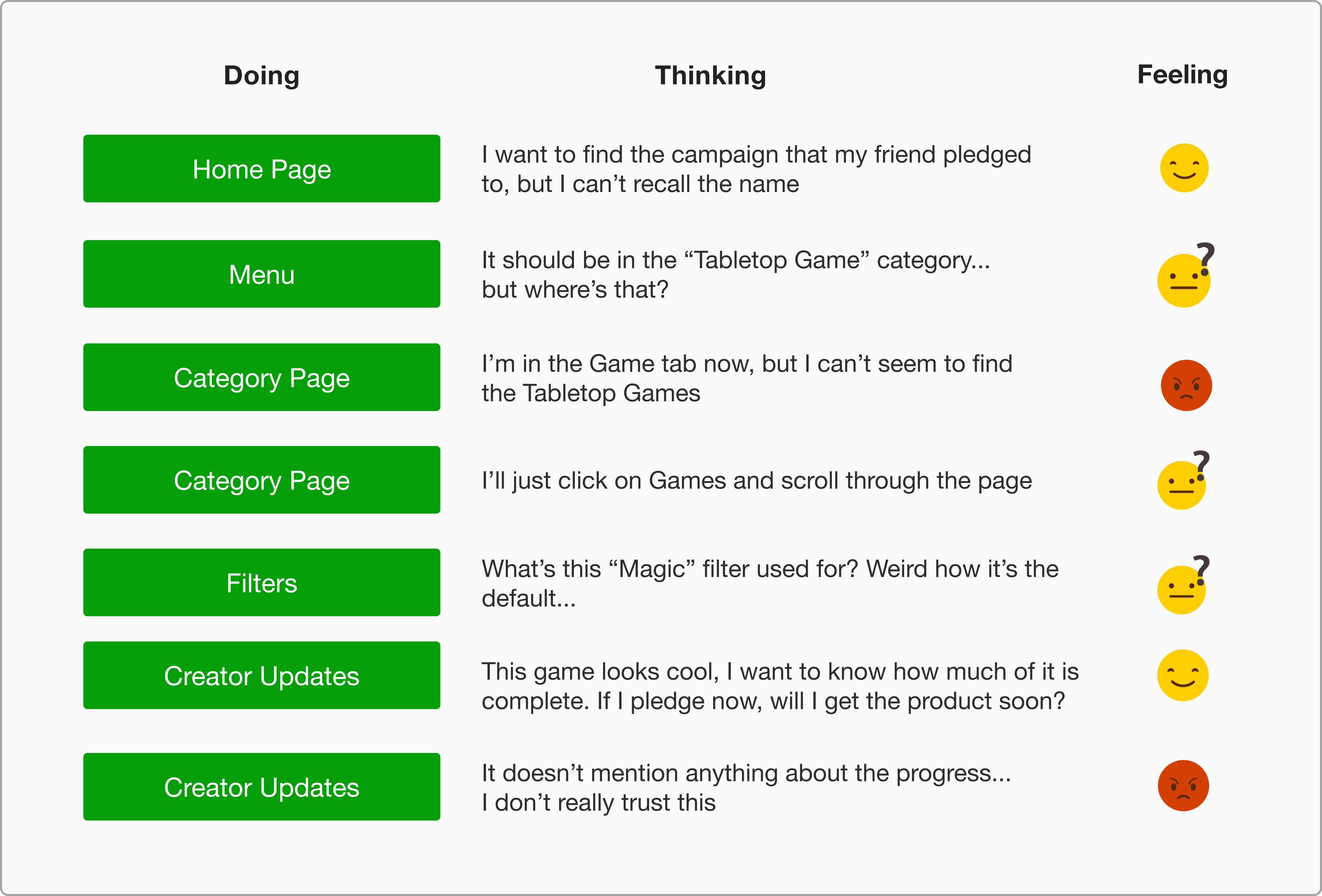
Below, we see the touchpoints where Joe currently experiences frustration:

Ideating a Solution
The following How Might We statements helped us reframe the user frustrations into areas of opportunity. With these core HMW statements in mind, we began our ideation process:
︎︎︎ How might we make navigation more intuitive, so that users can easily find what they’re looking for?
︎︎︎ How might we streamline the search process, so that users don’t waste unnecessary time?
︎︎︎ How might we increase trust in a campaign, so that users feel more confident about pledging?
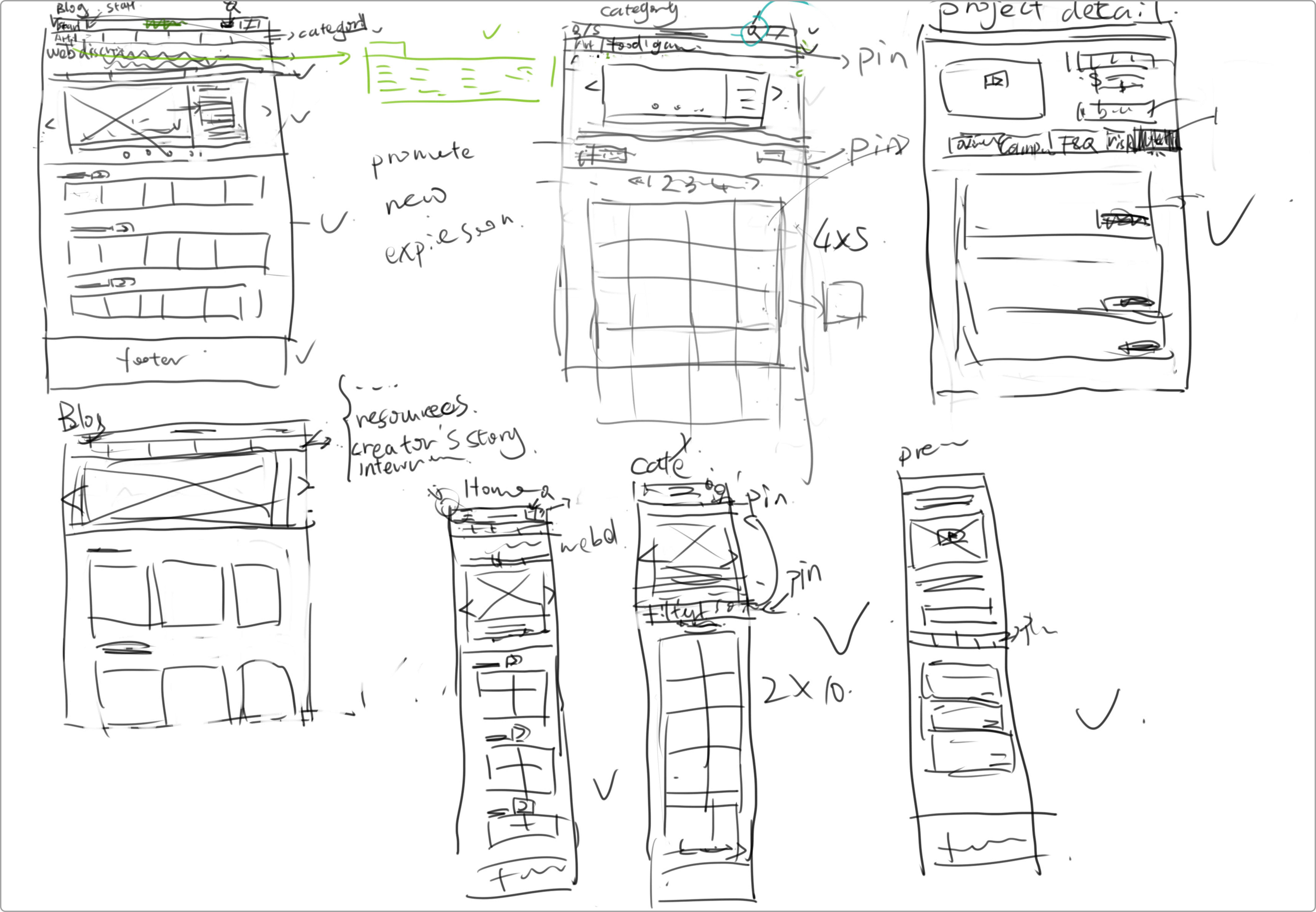
Sketches
![]()
Information Architecture: Menu
![]()
Wireframes
Campaign Page

Top Navigation
Filters
Final Design ︎
After conducting 2 rounds of usability tests (heuristic testing, A/B testing) and iterating based on user feedback, we arrived at the final design:

Thank you for reading!